Since the metrics and charts on this site will be similar across different strategies, this page will serve as a reference point to describe them in some detail.
Strategy metrics
The strategy metrics summarize all of the simulated sessions into a single measurement that can be useful to compare strategies.
- Average winnings ($): This is the “expected value” of your winnings, taking the average (mean) of the winnings across each session. Because all craps bets carry a house edge (except the odds bet, but that requires a pass line or don’t pass bet), this will always be a negative value (intuitively, you’ll lose money on average in the long run). I consider this the “cost to play” a strategy, relative to the type of session. Average winnings will scale with the betting unit, so if a strategy has a betting unit of $10 but you will be betting $25 units, your average winnings will be multiplied by 2.5 (25/10). Because average winnings incorporates the dollar unit of each bet, I find it to be more reliable than the house edge (%) metric.
- Variability ($): Higher variability indicates a wider spread in the possible outcomes from any particular session. It is calculated as the standard deviation of the winnings across each session. For strategies that follow a bell curve, you can expect roughly 95% of the sessions to fall within +/- 2 times the variability of the strategy; however, for skewed strategies it’s easy to look at the session quantiles (see below). Variability will scale with the betting unit, so if a strategy has a betting unit of $10 but you will be betting $25 units, your variability will be multiplied by 2.5 (25/10). Variability is a double edge sword—without it, you’re almost guaranteed to lose; with it, you have a chance at coming out ahead, but your potential losses could be magnified. As context, the variability of a $10 coin flip is $10 (for comparing to a per-shooter session), and the variability of ten $10 coin flips is ~$15.81 (for comparing to a per-10-shooter session).
- Win Chance (%): Win chance is the percentage of simulated sessions that had a winning result. More precisely, we look at each sessions bankroll plus the value of any unresolved, active bets and calculate the percentage where that number is greater than your starting bankroll, plus half the percentage where that number exactly equals your starting bankroll. The latter piece ensures that our win chance is balanced at 50% for a strategy that bets nothing. You could just as validly count the sessions where your starting and ending bankrolls match as “wins” or “losses”, here we split the difference. Win chance is the same regardless of betting unit.
Session quantiles
Session quantiles try to help give context for what an individual session could look like:
- Worst 1%
- Worst 25%
- Mid 50%
- Best 25%
- Best 1%
For example, if we simulated one million sessions, we would get a good picture of the possible outcomes of any given strategy. Then by sorting all of those sessions from worst (most money lost) to best (most money won), we could find the luckiest and unluckiest results for the strategy. But those outcomes would be (literally) one in a million, and highly unlikely to be something we’d actually see. If instead we looked at the result in the middle (the strategy ranked 500,000 of 1,000,000), that represents an average result which might be close to typical. In statistics, we’d call it the median or 50th percentile—for this site we’ll call it Mid 50%. Similarly, we can look at results that represent the Best 25% of winnings (ranked 250,000 of 1,000,000), the Best 1% of winnings (ranked 10,000 of 1,000,000), the Worst 25% of winnings (ranked 750,000 of 1,000,000), or the Worst 1% of winnings (ranked 990,000 of 1,000,000). These five summaries make up the session quantiles.
Session quantiles can also help us understand the range of possible outcomes. For example, between the Worst 25% and Best 25% is a range of half the sessions, so we know that roughly half the time we can expect to have a result in that range. 25% of the time we could do better, and 25% of the time we could do worse. And the Mid 50% breaks up that range into two evenly likely regions also. We know roughly 99% of the time we’ll have a result between the Worst 1% and Best 1%, giving confidence in a lower bound for our bankroll or upper bound on expected winnings.
How to read plots from The Craps Analyst
Resulting winnings after each simulated session
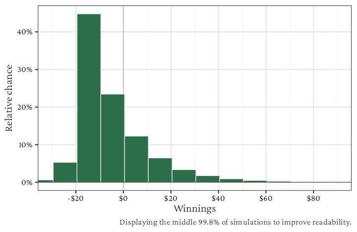
This is a bar chart (also called histogram) of the winnings across all simulated sessions. For short we’ll call this the “winnings bar chart.” Say each bin has a range of $10 (which is the default for per shooter sessions). Then the height of the bar depends on how many sessions fell into that $10 range. The vertical axis (heigh of the bar) shows the relative chance of a session falling into each bin (higher means more likely). These relative chances will seem small, but this is because we have many possible bins to look at.
The main purpose of the winnings bar chart is to show a realistic picture of what winnings could look like. For a balanced view, you can see the range of winnings matched with how likely they are. This chart also nicely illustrates any skew in the strategy. A bell curve has no skew, the tails go equally in either direction. Strategies like pass line or don’t pass (without odds) tend to follow a bell curve, and the more sessions you count, the more a strategy will start to resemble a bell curve (statisticians, that’s the Central Limit Theorem at work). What is skew? Skew is the opposite of a bell shape, where one tail of the distribution pulls towards high values to either side. Think about placing all the inside numbers (5, 6, 8, 9), where you have a large bet outlay that can be wiped away by a seven-out, but if the shooter goes on a long roll you could win huge amounts. That strategy will skew right (towards high winnings). Laying all the inside numbers has the opposite skew.
Which values fall in each bin? Assume the bin range is $10. By default, the first bin above $0 goes from $0.50 to and including $10.50 (note that most strategies end in whole dollar amounts, so this is effectively including $1, $2, …, $10 wins. The next bin goes from $10.50 to and including $20.50 ($11, $12, …, $20 wins). And the pattern continues. The first bin below $0 include from -$9.50 to and including $0.50 (losses such as -$9, -$8, …, -$1 and the tie at $0). The next bin to the left of this one is -$19.50 to and including -$9.50 (losses of -$19, -$18, …, -$10).
Because each strategy can have tail events that happen very rarely (huge wins or huge losses), the winnings bar chart shows the middle 99.8% percentage of simulations to improve readability. Essentially, we’ve removed the best 0.1% and worst 0.1% of outcomes.
Sample of 10 sessions
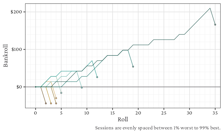
This is a line chart of showing how the bankroll changed across rolls for each of 10 simulated sessions. The bankroll includes the amount of money available to wager plus the value of all active (not yet resolved) bets. This includes both bets that could be pulled down and bets that can’t be pulled down (contract bets). Each different colored line shows one session, with dark brown indicating worst outcomes and dark green indicating best outcomes. The large dots at the end highlight where the strategy finished at the end of the session, and small dots indicate each time there was a new shooter (after a seven-out). The chosen sessions include the 1% worst, 99% best, and eight evenly spaced outcomes between that (11.9% worst, 22.8% worst, 33.7% worst, 44.6% worst, and similar for best).
The purpose of this chart is to illustrate how the strategy could feel when you have a good or bad session. Do you need to ride out big losses on the seven-out? Is the strategy constantly up and down or does it rely on a few great rolls to win?
This chart also shows how different session budgeting approaches can lead to different table experiences. For example, if you limit each session to 10 shooters and have a light-side strategy, then you will usually see the worst sessions don’t have many rolls (due to a few quick point-seven-outs). In contrast, the best sessions happen when a few shooters have long rolls (hitting many numbers and/or points). If instead you budget your session based on time at the table (per hour could be ~144 rolls), then on bad days you might need to weather long runs of bad luck at the table, but there’s also a longer chance for luck to even-out. Other budgeting strategies (including bankroll limitations, stop losses, stopping at win criteria) are not shown on the site, but they are possible to simulate with a bit of coding in crapssim.
Other notes
Many people will probably note that I don’t show the house edge (%) as a craps strategy metric. I may add in the future, but right now I don’t think it is the most useful way to summarize strategies. It fails to take into account the actual dollar amount of your bet, and at the end of the day, we win dollars (or euros, yen, etc), not percentages. It also fails to account for time in which you are pausing bets, which can meaningfully change a strategy. House edge is useful to understand which bets are worth taking, but when a strategy consists of multiple bets, that usefulness starts to break down, in my opinion.
Do you have a metric not shown here that you think others would find useful? Or a plot that could show key aspects of a strategy? Please reach out and let me know at crapsanalyst [at] gmail [dot] com.